Point.me had built something impressive under the hood: a search engine crawling hundreds of sites and flight APIs to calculate points value, transfers, and pricing. But the product wasn't converting or retaining users.
I led a redesign across three fronts, information architecture, the free tier, and the onboarding flow, to make it actually work for people who weren't already points experts.
Point.me helps people find and book flights using travel points, turning a notoriously confusing space into a guided experience. The technology behind it was solid: a search engine crawling hundreds of sites and flight APIs to calculate points value, transfers, and pricing. Unfortunately, the experience wrapped around it wasn't working. Adoption was slowing, especially among users who were considered novices to the points and miles world. For experts, users often understood the value of a robust search engine for points deals, so hiding the product behind a paywall wasn't so much an issue. For everyone else, however, they needed some kind of glimpse into what they could gain without putting down a credit card first.
The core flow of the product and Information Architecture (IA) was quietly preventing signups: when you landed on the homepage, you hit a paywall almost immediately, ending up on a pricing page that was somehow both overwhelming and difficult to comprehend. Additionally, the site gave people little reason to come back before they were ready to book, losing the users who needed time to warm up.
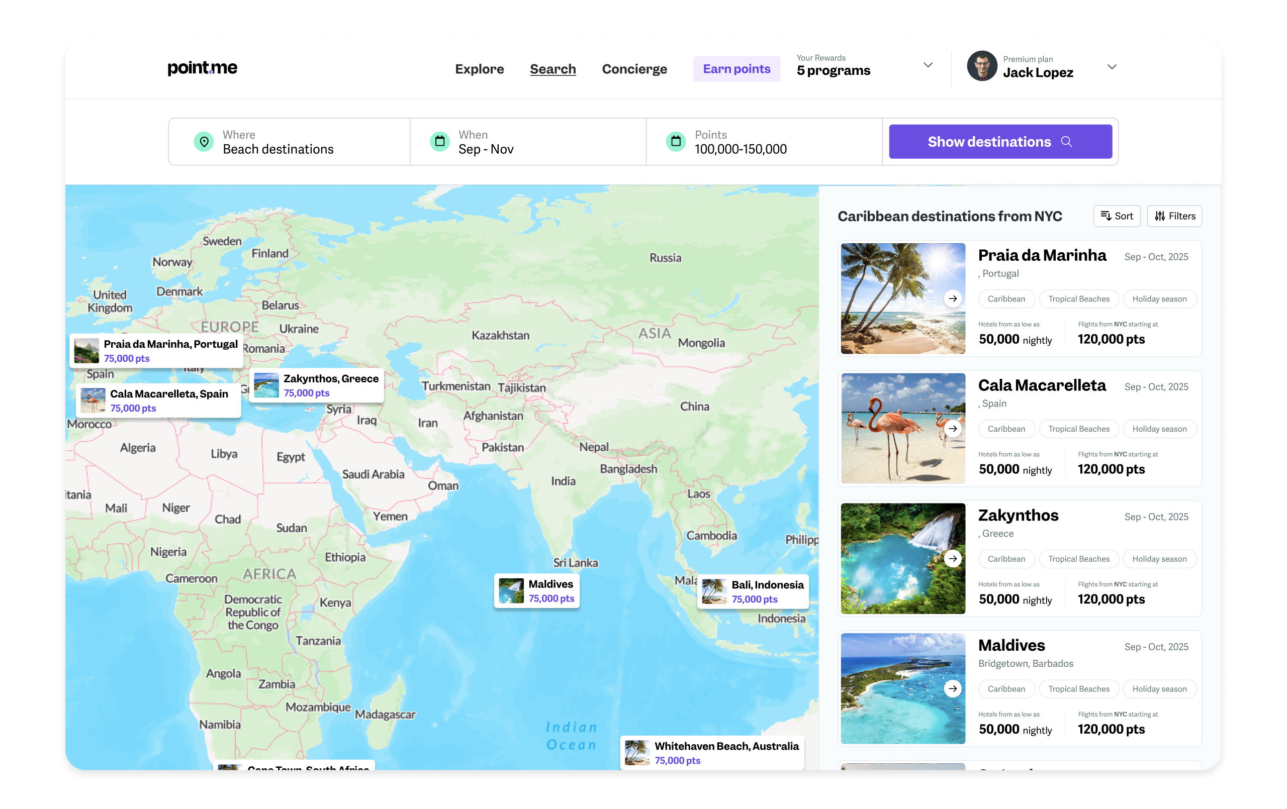
By moving the explore experience to the pre-authenticated step, curious users who were still shopping the product could get a glimpse at recently found flight deals before deciding sign-up.
Rather than dropping users onto a dense plans page, I led with an approach that took users to an explore page with functional search capabilities and cached search results, then placed various upgrade paths in the navigation, banners as well as embedded in the cached results modal.
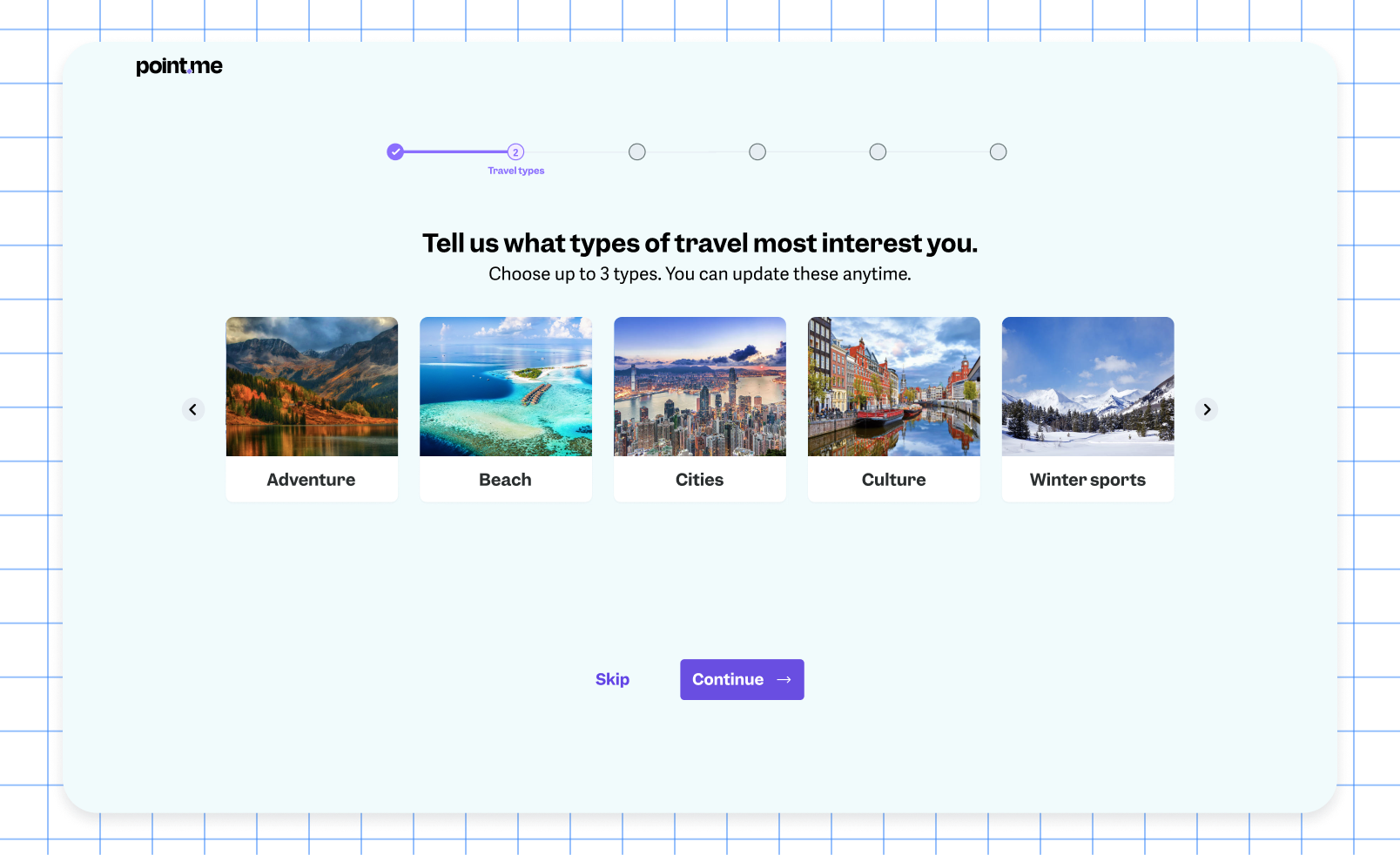
To create an even better onboarding experience for new users, we introduced an onboarding questionnaire that triaged people into a recommended plan or service based on their travel goals and existing points knowledge. It set expectations early, telling people what to expect from the process, and built some real excitement about what traveling on points before they'd done anything else in the product.
Map-based search, deal browsing, and travel inspiration gave users real reasons to keep coming back and stay in the product over time, which mattered as much for retention as it did for conversion, building habitual engagement first, with natural, non-pushy moments where someone would want to upgrade.
shifting focus from expert travelers (a shrinking, contested segment) to novices (an underserved, larger one). Triaging users from their first session, instead of forcing every skill level through one generic flow
Explore gave people real reasons to stay engaged, which made the eventual upgrade path feel earned rather than forced
every change was measured, which is what actually de-risked leadership's biggest fear
the concierge escape hatch meant users never felt stuck, even in a genuinely confusing domain