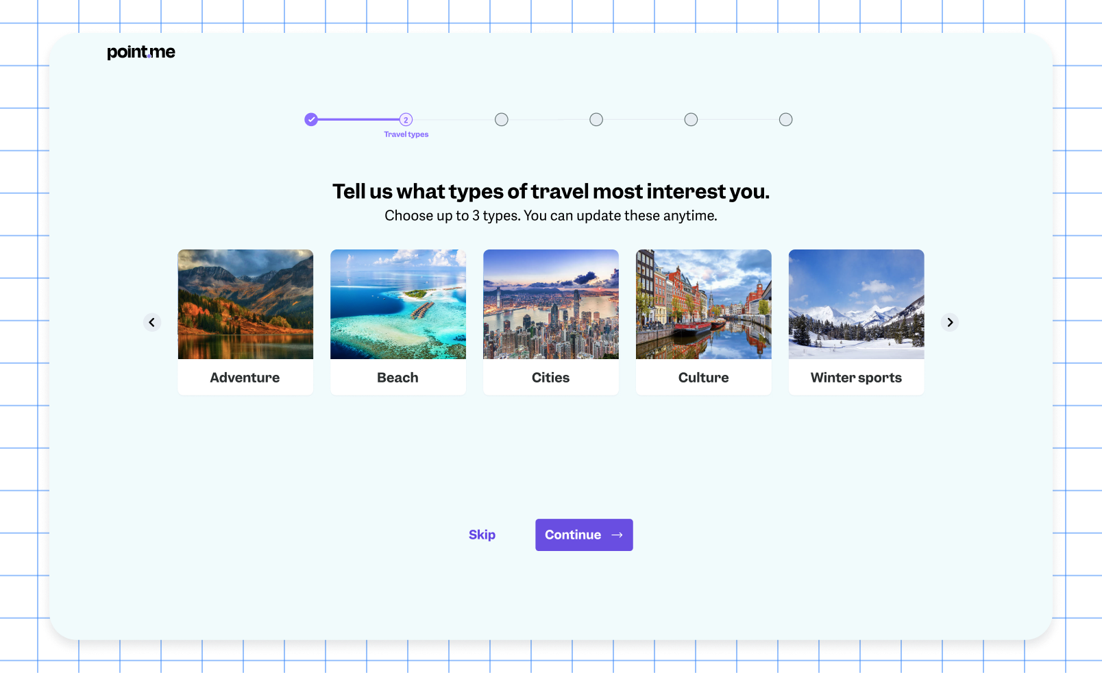
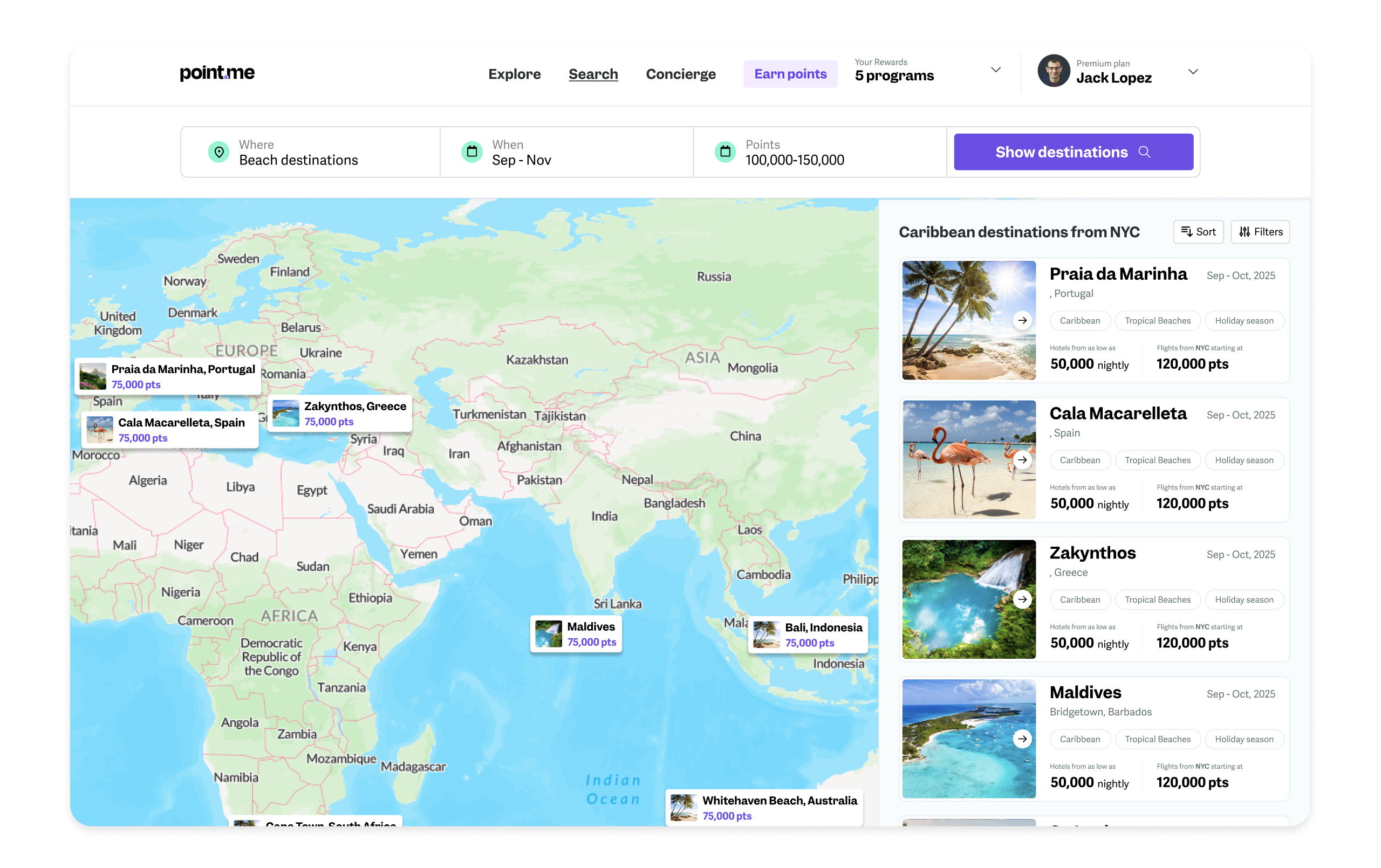
Point.me had built something impressive under the hood: a search engine crawling hundreds of sites and flight APIs to calculate points value, transfers, and pricing. But the product wasn't converting or retaining users.
I led a redesign across three fronts, information architecture, the free tier, and the onboarding flow, to make it actually work for people who weren't already points experts.
Point.me helps people find and book flights using travel points, turning a notoriously confusing space into something searchable. The technology behind it was solid: a search engine crawling hundreds of sites and flight APIs to calculate points value, transfers, and pricing. The experience wrapped around it wasn't.
The core flow of the product and Information Architecture (IA) was quietly preventing signups: when you landed on the homepage, you hit a paywall almost immediately, ending up on a pricing page that was somehow both overwhelming and difficult to comprehend. The free tier gave people little reason to come back before they were ready to book, losing the users who needed time to warm up. And the booking flow assumed expertise, information-dense screens that made sense to a seasoned points traveler, but lost everyone else.
None of these problems existed in isolation. A confusing IA meant most people left before seeing the product’s value. A thin free tier meant the ones who did had no reason to stay. And an expert-level booking flow meant even engaged novice users could fall off right before converting.
shifting focus from expert travelers (a shrinking, contested segment) to novices (an underserved, larger one). Triaging users from their first session, instead of forcing every skill level through one generic flow
Explore gave people real reasons to stay engaged, which made the eventual upgrade path feel earned rather than forced
— every change was measured, which is what actually de-risked leadership's biggest fear
— the concierge escape hatch meant users never felt stuck, even in a genuinely confusing domain